
How Do I Style a Monochromatic Outfit That Looks Intentional, Not Boring?
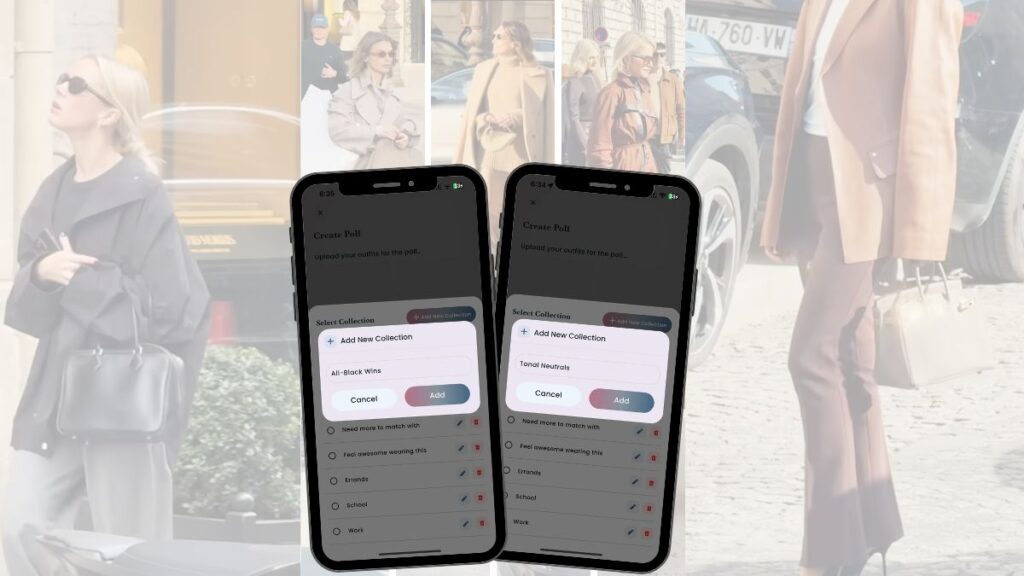
A monochromatic outfit isn’t boring. It’s one of the most advanced styling moves you can learn. I thought I’d talk about it on the heels of the “pop of color” post I just did because both are equally chic, and I didn’t want to imply (by talking about colorful outfits) that I don’t also love monochromatic outfits as well. Look at the beige-on-beige outfit with the cream knit, camel trench, and taupe trousers. Or the all-white look, layered with an ivory jacket and crisp white denim. These outfits work because they use multiple shades of the same color family plus texture contrast to create depth. Your body is unique. What reads as “elegant cream” on someone else might look unfinished on you, or it might be exactly right. The only way to know is to test it side by side. When you’re building a tonal look and can’t decide between the all-cream version or the version with a deeper camel coat, post side-by-side outfit selfies in Adjust My Crown and let real votes show you which one has more depth, or just use the side-by-side selfies to analyze the monochromatic outfit aesthetic for yourself. What Makes Tonal Dressing Work in Real Life Tonal dressing means staying within one color family—but using multiple shades and textures so your outfit doesn’t flatten out. Each piece is a slightly different shade of neutral, and each texture is distinct. That’s what creates visual interest without adding more colors. This is what to wear when you want to look polished but don’t want to think hard about color combinations or adding patterns. Once you know which tonal families work on your coloring and in your life, you can pick your outfit easily by stacking shades you already own. The formula stays the same: play with shades and play with texture and a quick test in your favorite new wardrobe app to confirm it works on you. Tonal Dressing Can Be Colorful Too Monochromatic simply means working within one color family. That family can be camel — or it can be raspberry, butter yellow, lilac, cobalt, sage. The sophistication comes from variation, not neutrality. The formula is straightforward: Head-to-toe pink works when it moves from blush to rose to fuchsia. Purple feels intentional when lavender is paired with pink. Yellow becomes polished when pale butter meets deep marigold instead of one flat tone. Neutrals are safe. Tonal color is strategic. When done well, it reads confident — not loud. The Shade + Texture Formula Start with different shades within the same color family. In the tan and brown outfits, you’re seeing ivory, camel, and chocolate brown layered together. In the all-black looks, there’s charcoal, true black, and softer black knits creating subtle contrast. The shades are close enough to feel related but far enough apart that you see the difference in a photo. Then add texture contrast. Texture is what makes a monochromatic outfit look interesting and stylish instead of flat. It’s the fastest way to elevate without buying anything new. If you’re torn between two versions—maybe swapping the cream sweater for a beige one, or choosing between tan boots and white boots in your neutral look, consider it with the help of side-by-side outfit selfies in AMC. Post both options and let votes show you which combination reads as more intentional. A wardrobe app like Adjust My Crown makes this a 30-second decision instead of a 20-minute spiral, and AMC also helps you remember the outfit to wear on a “nothing is going right” kind of morning (which are coming, whether we like it or not). Why Side-by-Side Testing Matters for Tonal Looks Tonal outfits are unforgiving in one specific way: if one shade is off, the whole thing can look like you got dressed in the dark. That’s why you need to see your options next to each other. Compare the black-and-white outfit to the all-black version —both are monochrome, but they create totally different effects. Take two photos in the same light. In one, wear your planned tonal outfit. In the other, swap one shade—try a darker coat, lighter trousers, or a different texture. Post both as a poll. Use the side-by-side outfit selfies to analyze the difference based on your proportions. Color “blocking” looks incredible on some people but doesn’t add that confident polish to others. Your proportions are totally unique to you and how your shades and colors best accentuate your gorgeous self is as unique as you. The votes will tell you whether your original plan works or if one piece is dragging the look down. You’re not asking if it looks “okay.” You’re asking which version creates the most depth and intention. Maybe you don’t want votes, you just want to see the outfit selfies side-by-side. Just end your poll immediately. It’s my favorite way to use AMC, personally. The side-by-side outfit selfies are how you build confidence in your tonal formulas without relying on someone else’s body or someone else’s rules. Once you find a winning combination, Adjust My Crown automatically saves it into your Collections. Name it “Tonal Neutrals” or “All-Black Wins” so you stop forgetting what to wear when you want that polished, monochromatic outfit aesthetic again. You’re not reinventing it every time. You’re just repeating what already worked. Learn from These Street Style Tonal Outfits The burgundy and brown leather outfits follow the same rule. Rust trousers, chocolate blazer, cognac boots—or wine-toned leather pieces with deep brown accessories. These aren’t accidents—they’re tested formulas. You can build your own versions by pulling three shades from your closet, adding texture contrast, and posting a poll to confirm it works on your body. This is how you pick your outfit based on evidence instead of hope. You’re not guessing whether beige looks good on you. You’re testing whether this specific beige next to that camel and this cream creates the depth you want. Big difference. When you do commit to tonal dressing, save the wins in Adjust